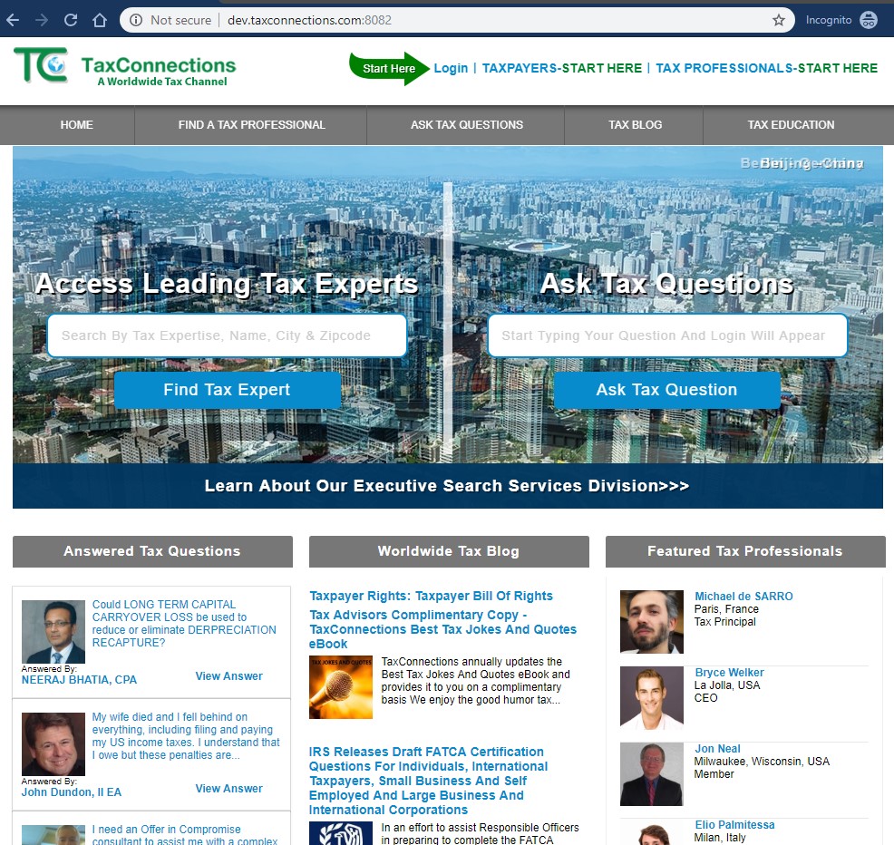
The goal was to improve the user experience, modernize the aesthetics and increase conversions. TaxConnections site hadn't been updated in a while and there were a lot of known customer pain points which needed to be addressed.
- Web Design
- Front-end
- UX Design
- Back-end Visit Site
Improve website usability for visitors
The tricky part was that there wasn't scope for a back-end rebuild, so I had to work with what was already there and change the front end into something new. The other issue, was that the site was not responsive.
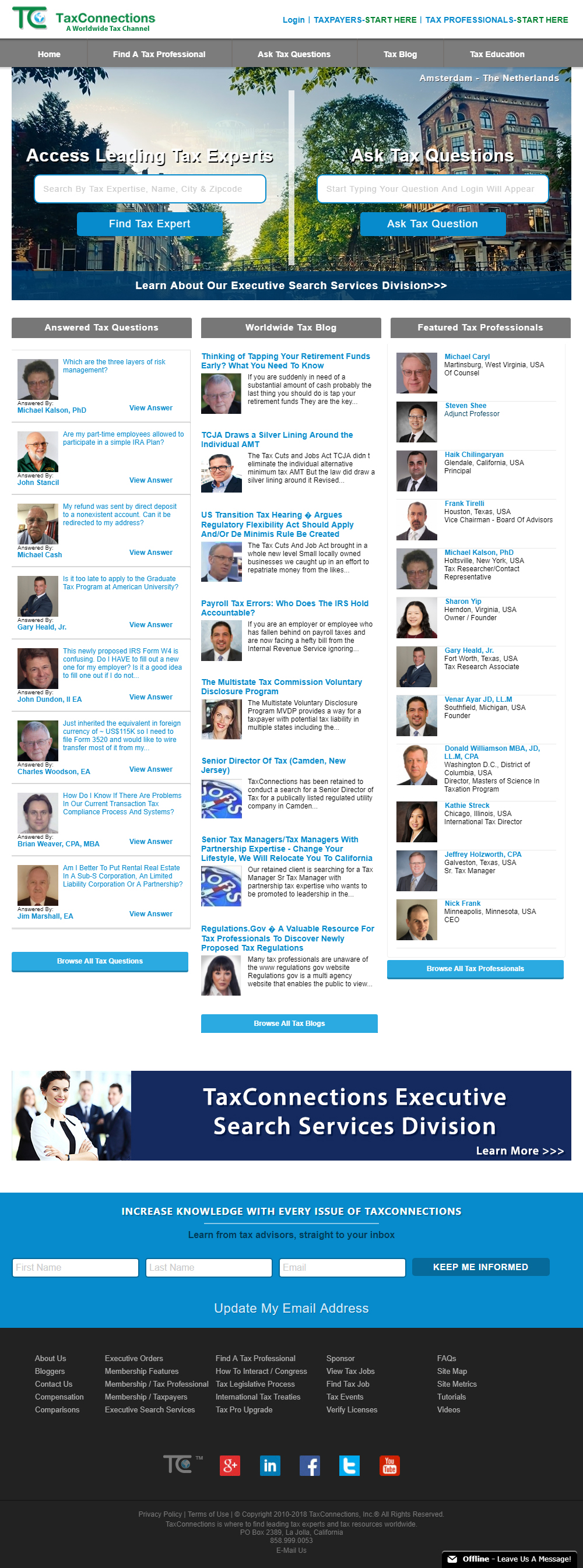
Nothing is more frustrating for a website visitor than a website that doesn't fulfill their expectations. Therefore, it is important to view your site from the visitor's perspective when coming up with a design. Accessibility, user experience, and user interaction were among the most important factors to consider when redesigning this site.
The offering that TaxConnections brings has a number of angles and segments that needed to be organized in a way that made sense for their customers. A solid and intuitive navigation and easy-to-read page layouts helped to achieve this. Not to mention generate new leads as a result.
Site features
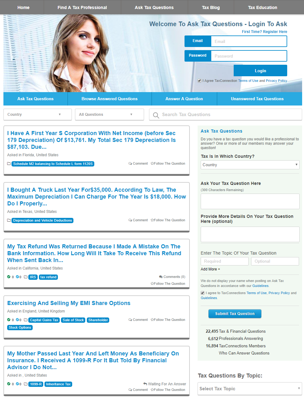
One of the main features of TaxConnections to for users to ask tax related questions. This questions can only be answered by a certified Tax Professional registered on the site. Users can vote on both answers and questions, and through this process users earn points.
Along with posting questions and answers, users can add comments to them, edit text written by others and ask directly for clarification since a lot of questions are very user specific.
There is a large base of users who require from simple to very complex answers to their legal problems, and there is a group of Leading Tax Advisors who are constantly answering questions to those who seek advise.
More features
Another feature of the site, is the ability of find Tax Professionals to connect with and build business relationships.
TaxConnections allows members (both workers and employers) to create profiles and 'connect' to each other in an online network. Members can invite anyone (whether an existing member or not) to connect. An introduction is first required, this is to build trust among users, if the intended user approves the introduction, the are now connected in an online social network which may represent real-world professional relationships.

Improve SEO and site performance
To make the website a lead generating machine, we needed people to actually see it, and one of the main purpose of the blog was to establish authority.
After many changes and iterations, both in code and design, the blog now forms part of the Top 100 Tax Websites & Blogs For Tax Professionals & Payers.
This now means Blogging is a great way to help market and promote the business products and service.

Improve the quality and volume of leads generated
When people first come and read the blogs, it's highly unlikely that they will buy something right away. Even though a blog helps to inform and educate your audience about your product, it does not “sell” your product. In fact, it usually takes a prospect seeing your content or brand multiple times before they make a decision. Often, this process takes several days or weeks.
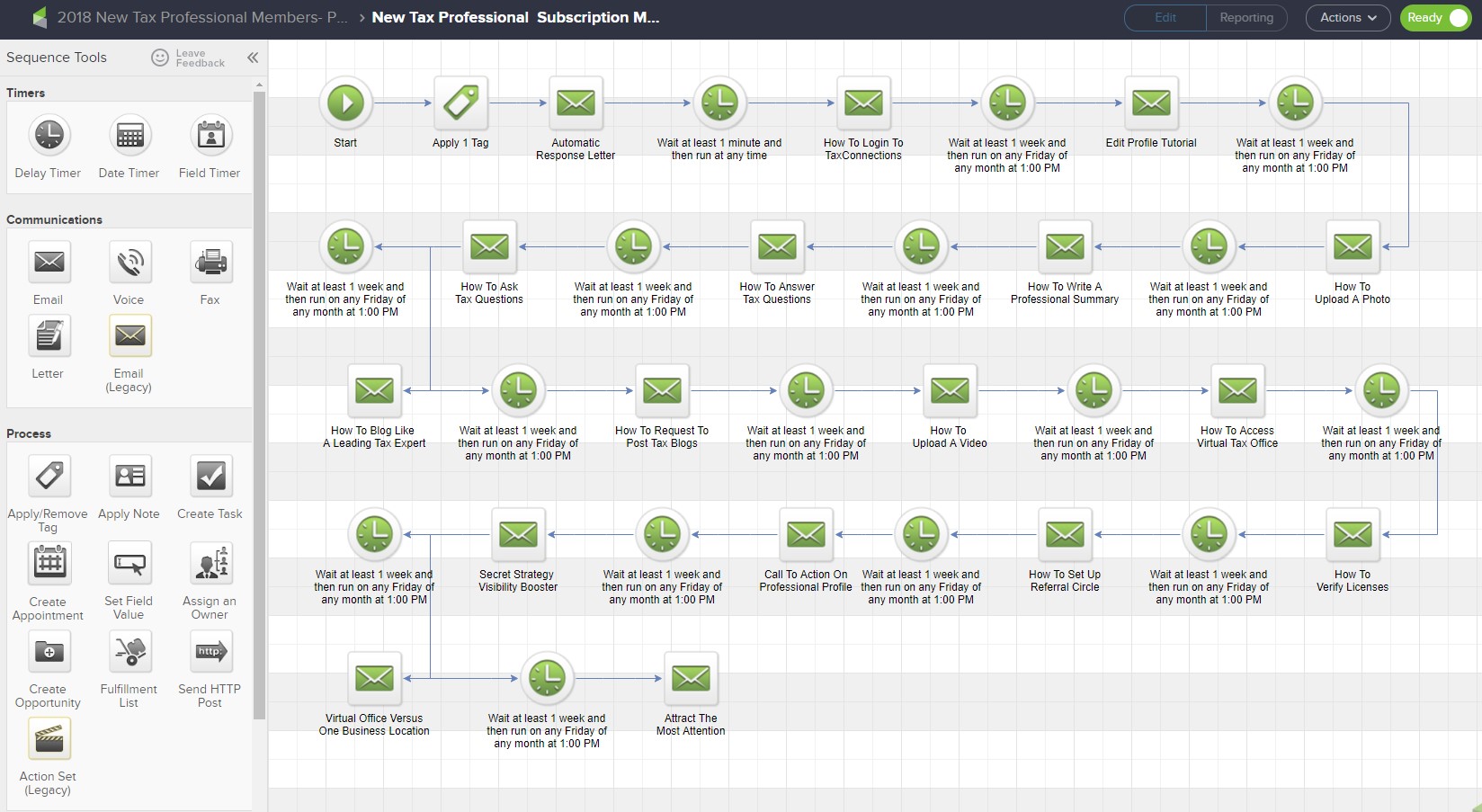
Also, one important aspects to keep in mind was to 'get the right message to the right client. This is where using a customer relationship management (CRM) is the was to go to automate the lead-capture process.
Sure there are multiple alternatives out there, but we decided to go with Infusionsoft by Keap for the simple reason that It's got all the advanced tagging, sequences, tracking and segmentation features that we needed.
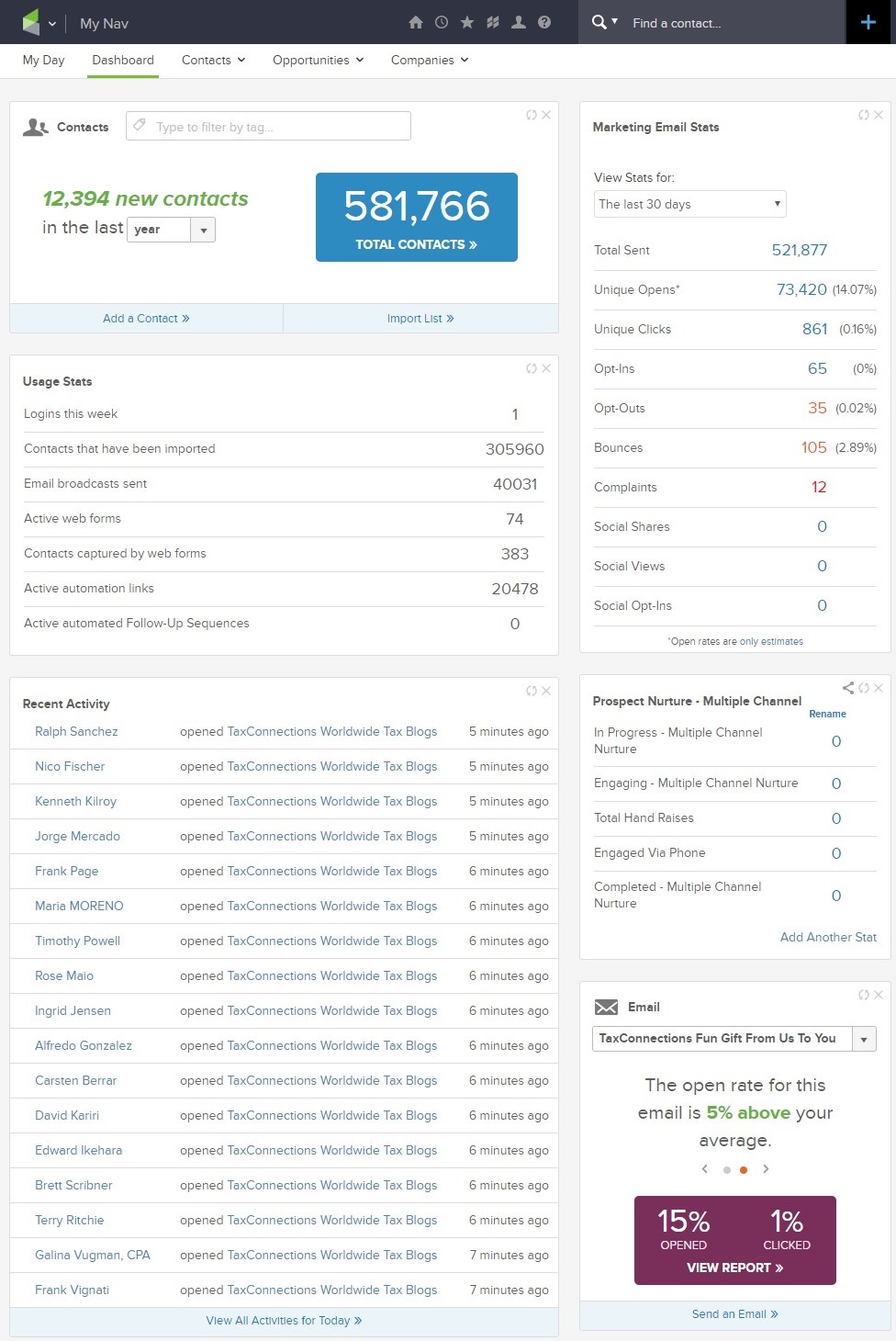
Secondly, it's simple once you get the hang of it, and a big problem with systems other systems is that frankly they're badly designed from a usability perspective.
We decided we needed that kind of flexibility to exist on our site better by creating landing pages, set up workflows that automatically trigger a sequence of email messages based on client behaviors the website is now able to perform significantly better.

Improving performance
One of the cornerstones of a successful business in today's digital environment is ensuring that the website performance is user-friendly and runs smoothly. A well-oiled website and its applications represent the face of a company, and in an ideal scenario, they serve as a mark of reliability, innovation, and progress.
After dealing with many design and user experience challenges, the next big step was to improve the website performance, security and ensure future support. The site has been using a now old version of PHP5, everything works fine, however, there are many benefits of upgrading to a new PHP version which will make sure, the site performs better overall.
The biggest problems with switching to PHP 7.0 can be caused by compatibility. The site core can be adjusted to the newest version, however, there is no guarantee that additional modules will be compatible too. That is why it was crucial to use a staging server to test each part of the site and make sure it works as expected.
After many test, the site is now up to date, it performs better and everything now runs smoothly. The advantage of PHP 7.0 over PHP 5.6 is indisputable, the page loading time was greatly reduced.
Facilitate integrations with external software
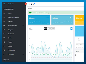
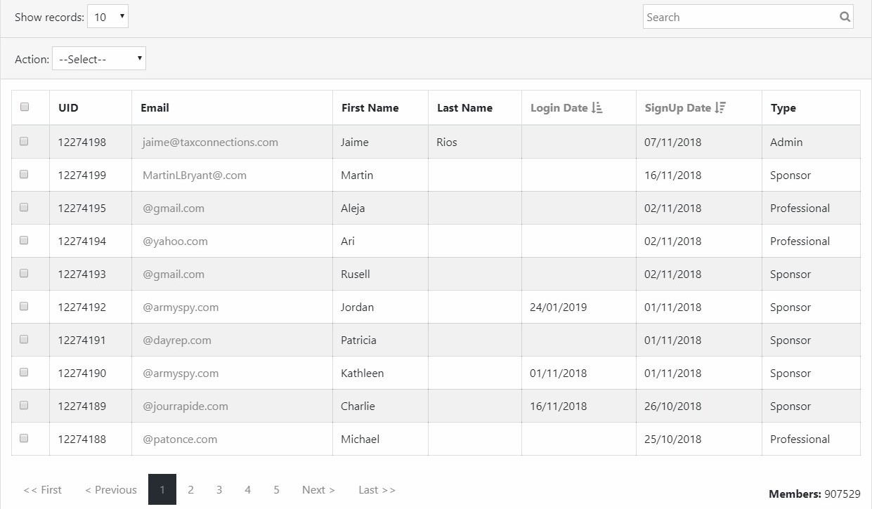
In order to keep users organized, we developed an in-house Admin Dashboard, this way, we can immediately see a detailed overview of the business in one quick glance. Better yet, it reduces the amount of time it takes to compile reports, saving time.
Takeaway
I was greatly appreciative of the opportunity to work with my client to help build them a solid brand and web presence. We enjoyed working together during the creative process and we're all very happy with the result. I hope their investment brings them long-term gains in the years to come.
